Alabama Booksmith
Redesigned the existing website to create a modern and user-friendly shopping experience.
My Role: UX Designer & Researcher
Duration: 2 weeks
Tools: Figma, Miro
CUSTOMERS need an efficient way to shop for a personalized gift because they like instant satisfaction.
“How can we improve customers shopping experience? What if we made their checkout experience easier?”
Alabama Booksmith is a local bookstore in Birmingham known for its collection of signed editions. They also host a variety of events and invite authors to speak. However, their existing website does not offer a user-friendly shopping experience and lacks flexibility. My goal was to create a modern and simple website that resembles the welcoming southern charm of the bookstore.
Meet the gift giver
From the data that I had gathered on the Alabama Boosmith’s user base, I composed a target user the gift-givers. They were customers that like to make purchases quickly and at the last minute. They prefer to look for meaningful gifts within a price range and don’t care much for reviews. The first thing they look for while shopping is recommended items listed.
I started asking questions…
Based on the persona, I created a list of ‘how might we…’ questions to help us narrow down our user’s needs.
How might we provide an easy shipping and checkout experience for the user?
How might we provide a list of suggestive gifts based on age or interests?
How might we make browsing for gifts easier for the user?
How might we cater the website to be a convenient shopping experience?
Possible solutions
I thought of several possible solutions for the redesign of the desktop app. I specifically focused on these features;
Improving the site map organization
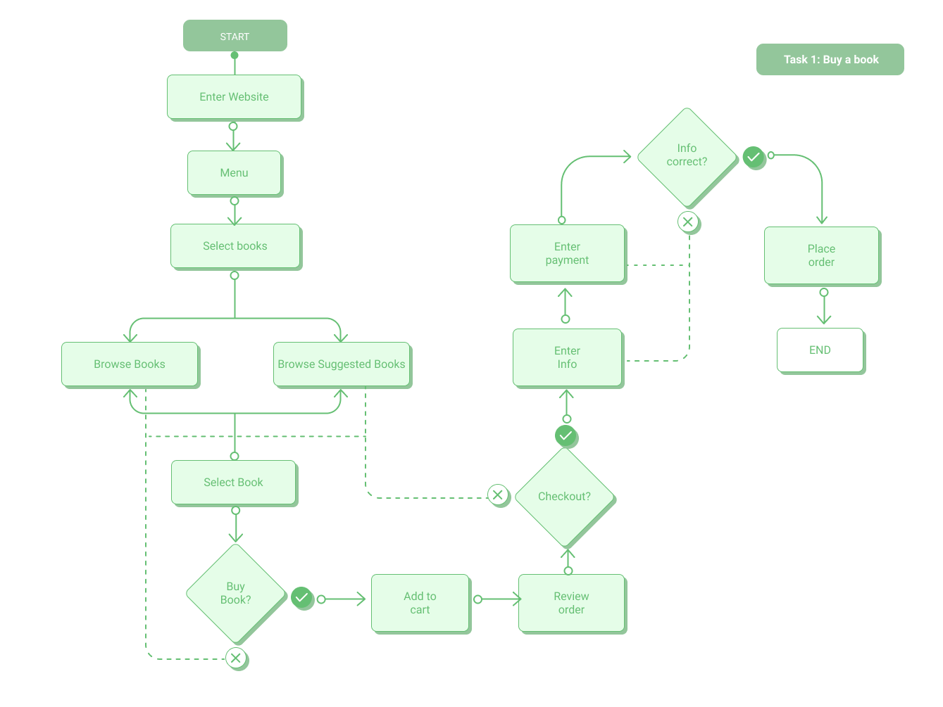
A simple and easy checkout experience
Visually appealing front page with efficient navigation
The redesign process:
I conducted further research to understand the e-commerce experience. I did this by doing a comparative and competitive analysis on several companies such a Books-A- Million, Barnes and Noble, Half Priced Books, REI, ULTA, and Blue Bottle. My key takeaways from these companies; “quick add to cart” features, a modernized layout, and a cleaner image. I gained a tremendous amount of insight from these companies, especially Blue Bottle. It became a great source of visual inspiration for the overall design of the website.
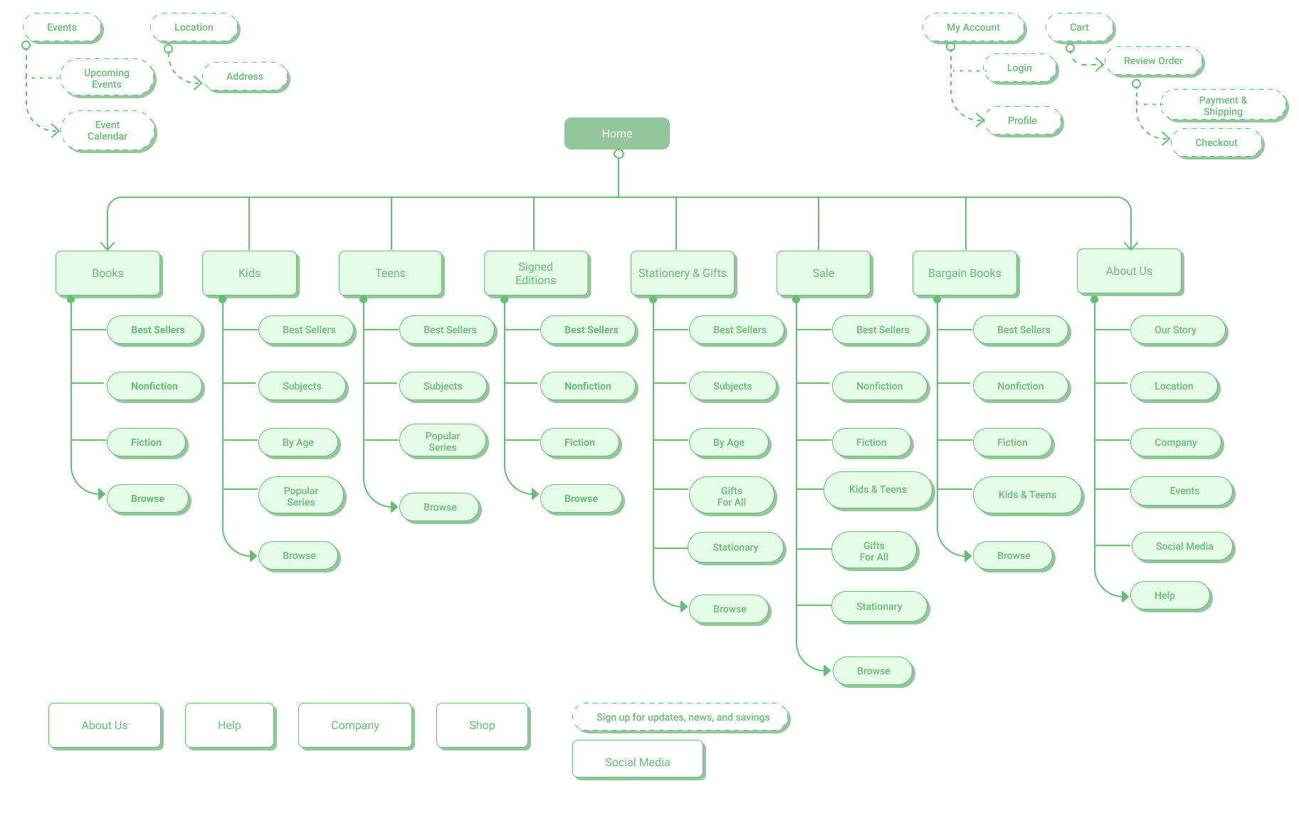
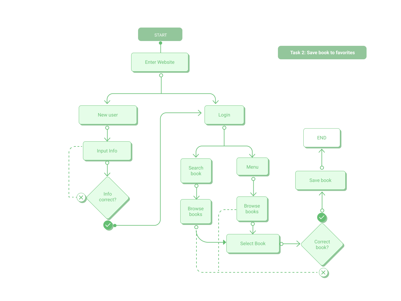
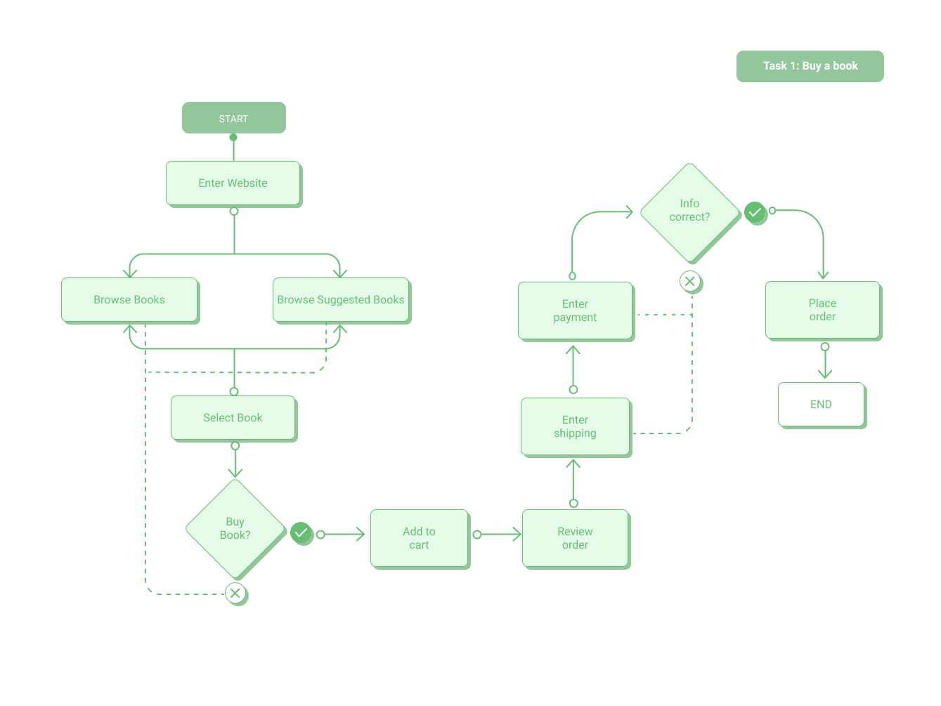
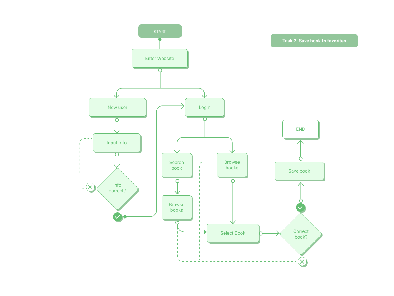
In the following images, I generated a site map of possible organizational navigation, which I deviated from throughout my design process to better fit the simple layout of the website. I was determined to have a simple two-step checkout process so I created a simple user flow to verify this task.
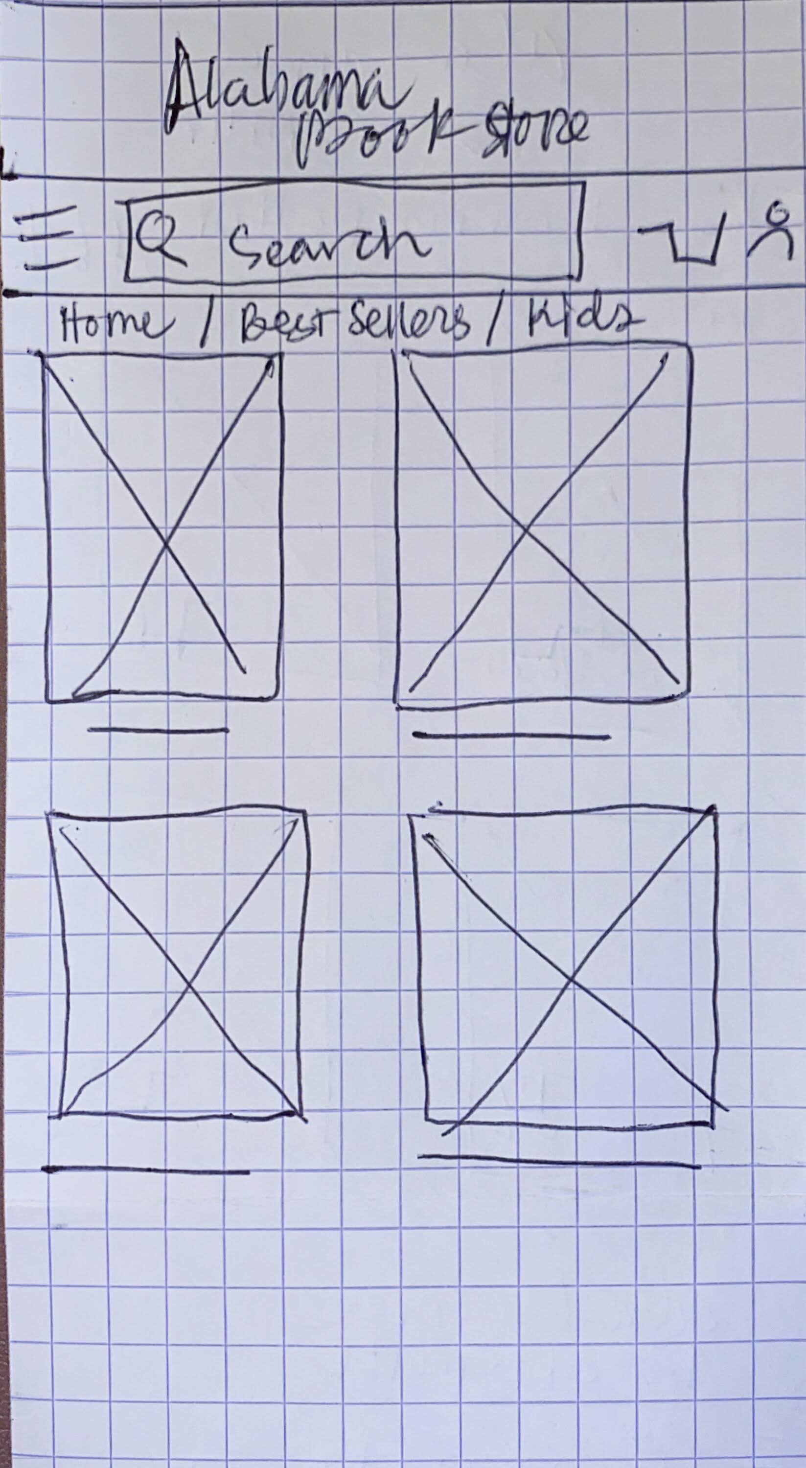
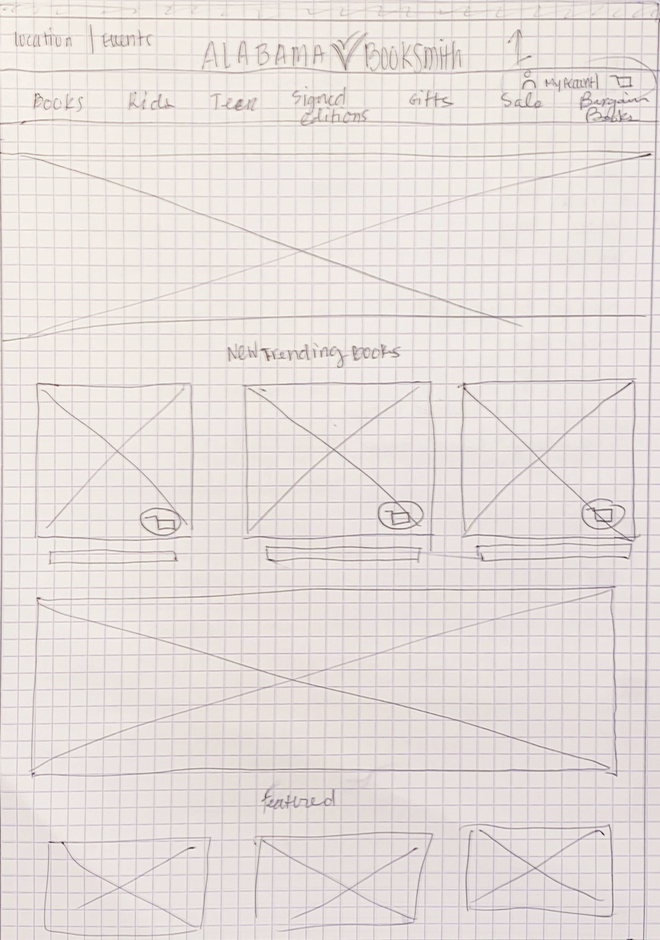
Let’s sketch it.
Once the foundations for the design project were set, I rough sketched screens that would accompany the user tasks. Visualizing and ideating what aspects of the design I would like to include in the mid-fidelity wireframe.
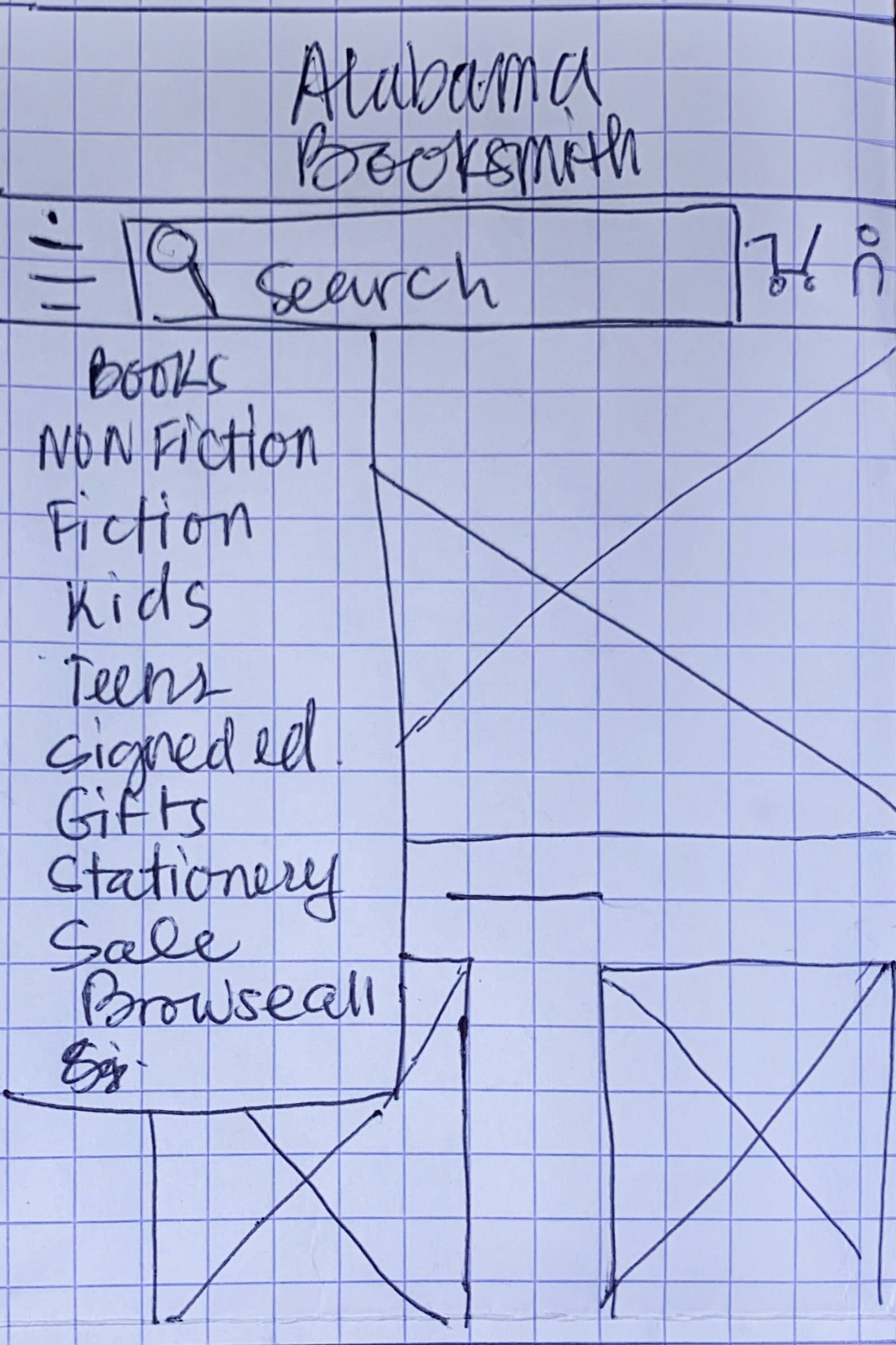
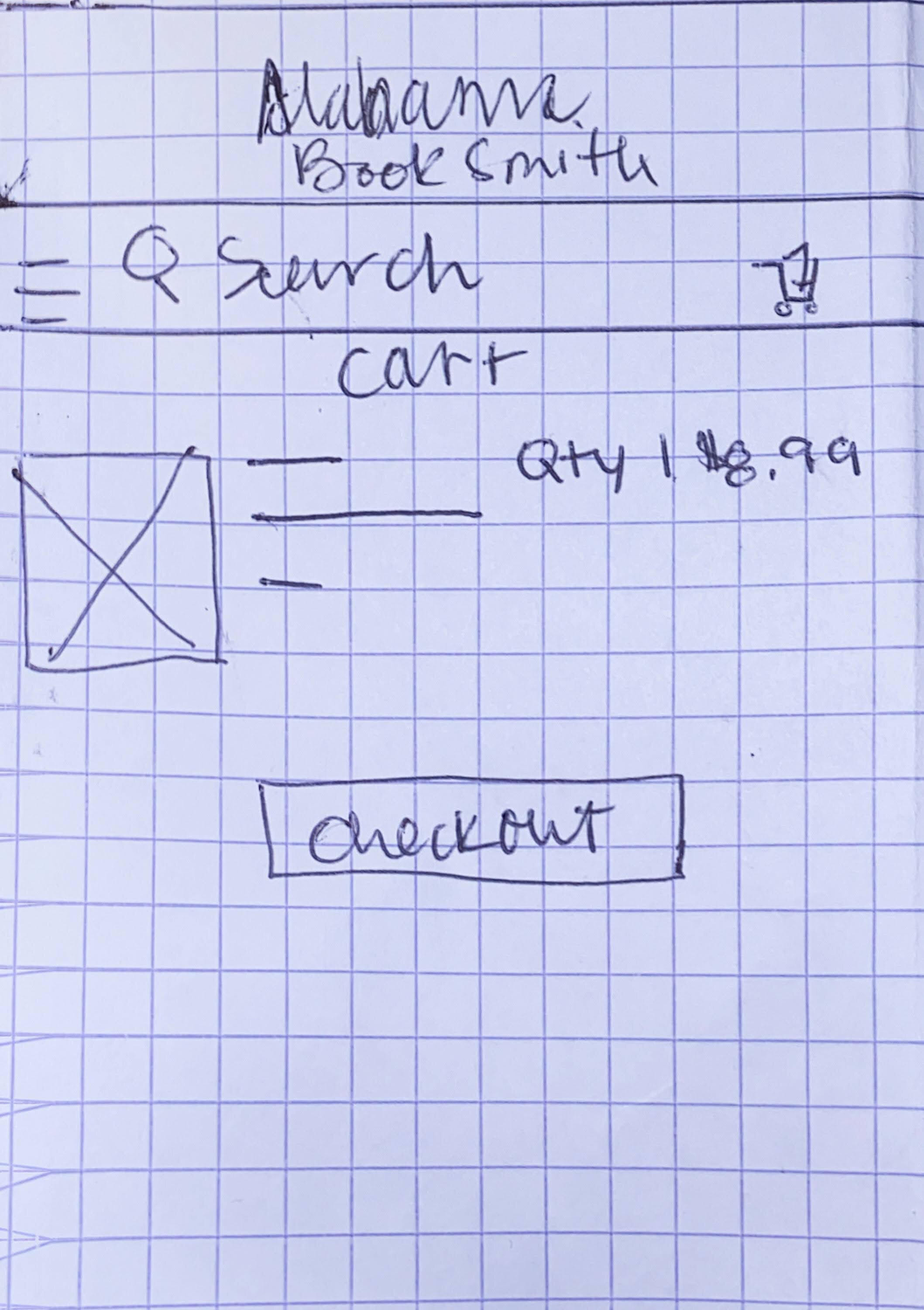
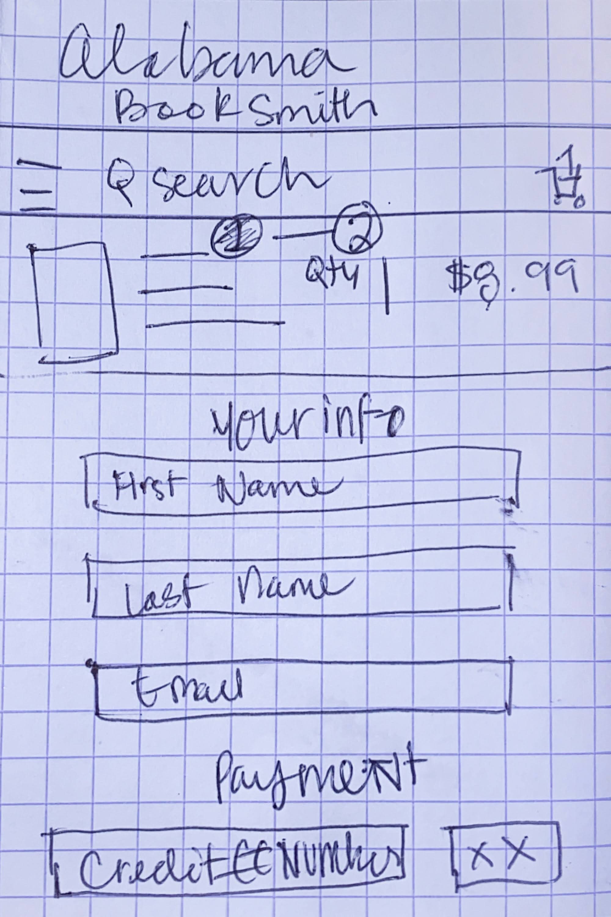
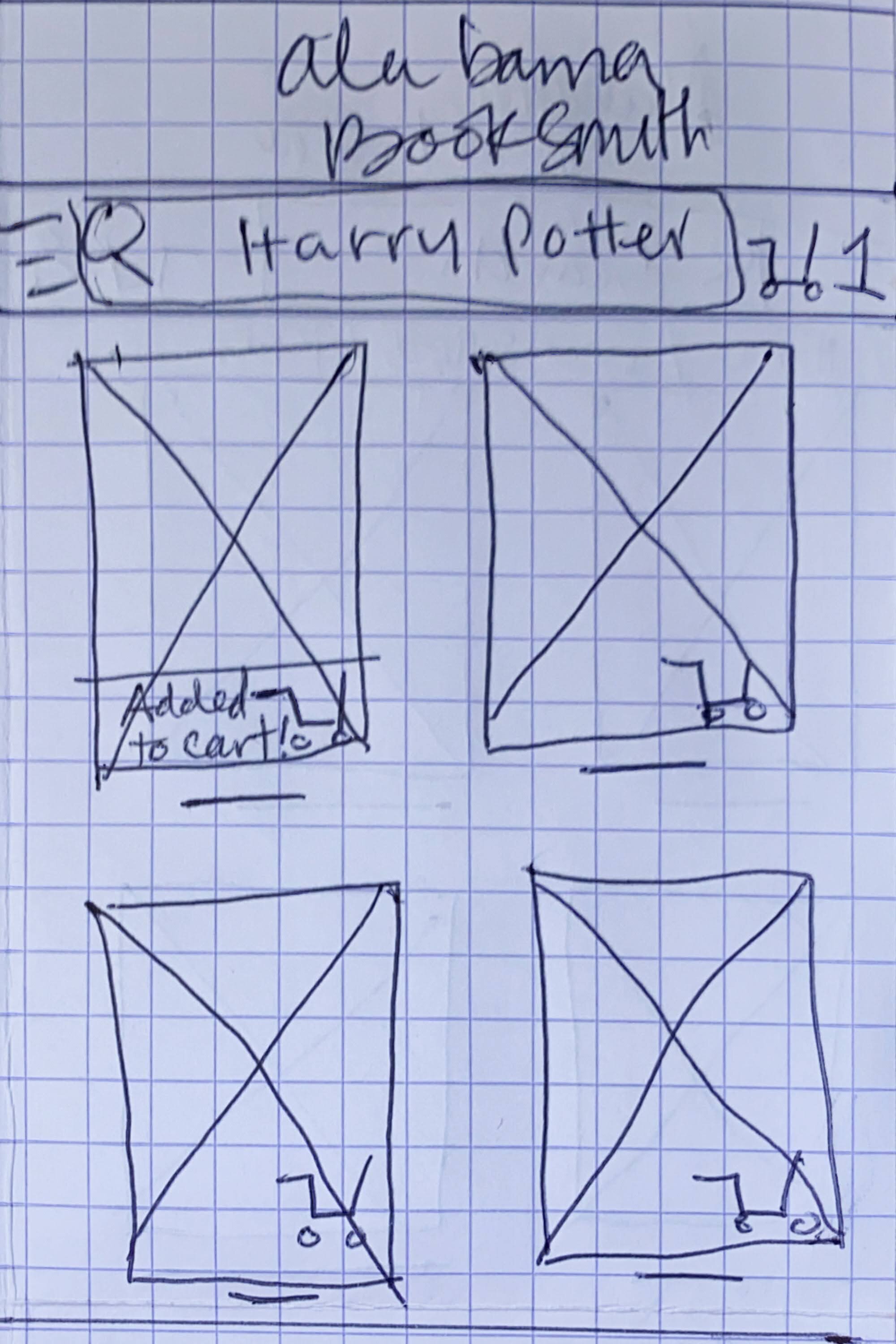


Let’s build it.
While creating the wireframe I refined my design and added features that weren’t included in the rough sketch. From here I started adding hotkeys for a working prototype. While doing this, I realized that some of the organization navigation that I started with was not efficient for the design so I revised the site map to be more efficient.
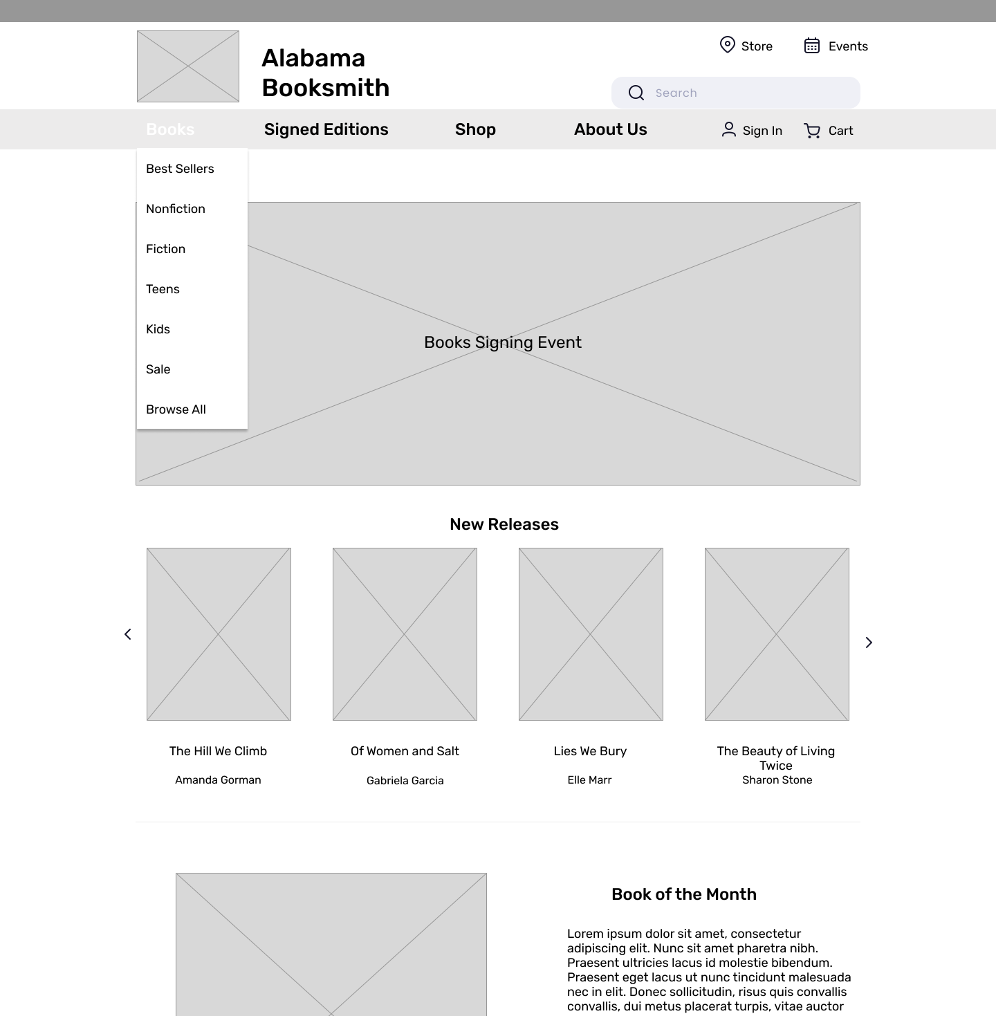
Simple and uniformed layout so that the user can easily browse through products
Navigation is visible and clear so that the user can freely move around the website
3 drop-down menus which I later changed to 4 after doing usability tests.
Let’s test it!
Round 1 of User testing
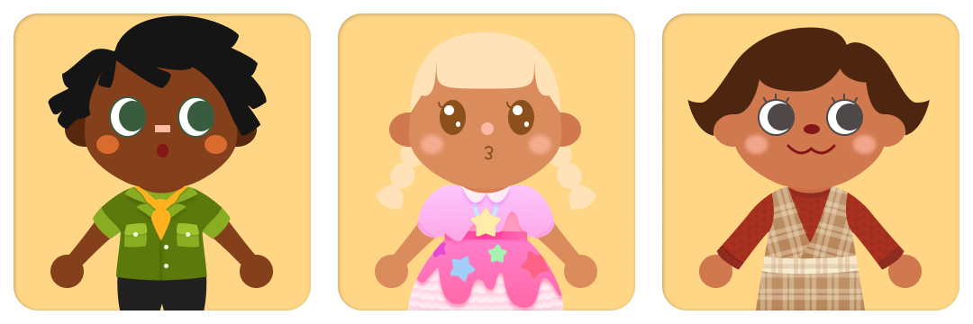
I asked 5 participants to test the mid-fidelity prototype over Zoom. Their task was to go from product discovery to checkout within 1-2 mins.
Participants:
Findings
I found that more than 75% of users were confused or hesitant towards the book or shop drop-down menus. Half of the participants wanted a direct action to go to the cart after selecting a book. I had a 100% success rate on the checkout process because the users found it helpful and easy.
Challenges
Based on my competitive analysis I found that each bookstore had its own way of organizing its navigation bar. So I focused on simplifying Alabama Booksmith’s navigation but the test results show that users still had a difficult time. Wording for the CTA buttons was also something that I found tricky to figure out.
Solutions
The feedback from the usability tests proved to be insightful. I carefully analyzed the data and produced several possible solutions;
Run a card sorting activity with the Alabama Booksmith’s navigation categories.
Correct the wording on the CTA buttons to clearly state action items.
Provide additional email confirmation after purchase with estimated shipping time
Mockup time!
At this stage of the project, I want to make sure that I provided a visually welcoming homepage. Some of the significant design decisions included;
An updated logo for a modern yet simple look. My intention was to match the logo to the overall theme of the website.
The simplistic and clean design of the mockup was inspired by Blue Bottle Coffee’s website.
I focused on making sure that information throughout the website was easy to digest while retaining visual satisfaction.
Next steps
This project was a fun experience for me, I definitely gained valuable insight and knowledge while researching e-commerce type business. If I had more time and opportunity to work on Alabama Booksmith, I’d run another usability test after card sorting the navigation bar. I would want to find a way to sort bookstore categories in a more efficient way.

