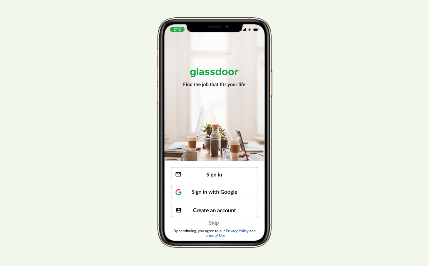
Glassdoor
Redesigning Glassdoor’s mobile app features to improve it’s utility for users.
My Role: UX Designer & Product Manager
Team: Chris, Joey, & Wade
Tools: Figma, Miro
Duration: 2 weeks
JOB SEEKERS need an efficient way to search so that they know they’re qualified because finding the right job can be emotionally exhausting.
“How can we help users track their applications? What if we make it easier for users to utilize Glassdoor's full potential?”
Glassdoor is well known for their indepth reviews of other companies. They also allow users to search and apply for potential jobs. However, our data shows that a majority of users are unable to utilize job search features on the mobile app. We suspect that users are not able to interact with the mobile app intuitively.

Talking to job hunters…
In order to find possible solutions to improving the mobile app, we spoke to various users about their experience using job searching apps. By doing this we were able to understand the way they searched for jobs and their pain points from it. We learned that users had trouble navigating through the app and some of them include;
Searching for jobs
Tracking job applications and saved jobs
Clear and easy to read job descriptions
We also conducted a comparative and competitive analysis on popular or similar platforms. This proved useful and it helped me guide my team during our design process.
Meet Claire
Claire is a persona we created based on our research. She represents our user’s needs, goals, and frustrations. This helped us direct our focus to think of realistic problems and solutions.

We started with questions…
After synthesizing the data we gathered from our user research. We created a list of ‘how might we…’ questions to help us narrow down our user’s needs.
How might we make it easier for users to utilize Glassdoor’s features?
How might we make the job tracking sync with search?
How might we integrate more social features to require company verification?
How might we bridge the communication gap between applicant and company?
Possible solutions
We discussed several key features that would need to be redesigned. I proposed improving the following features;
Improving the search and filter process
Providing a way for users to track their application process.
A form of contact between the applicant and the hiring company.
Time to iterate, iterate, and iterate…
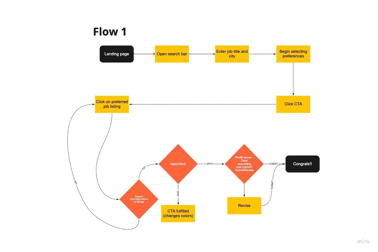
Based on our findings above we were able to establish concrete solutions for improvement. This set the groundwork we needed to create a simple user flow to guide us. So I also drafted a detailed sprint to meet deadlines and accomplish the necessary tasks needed.
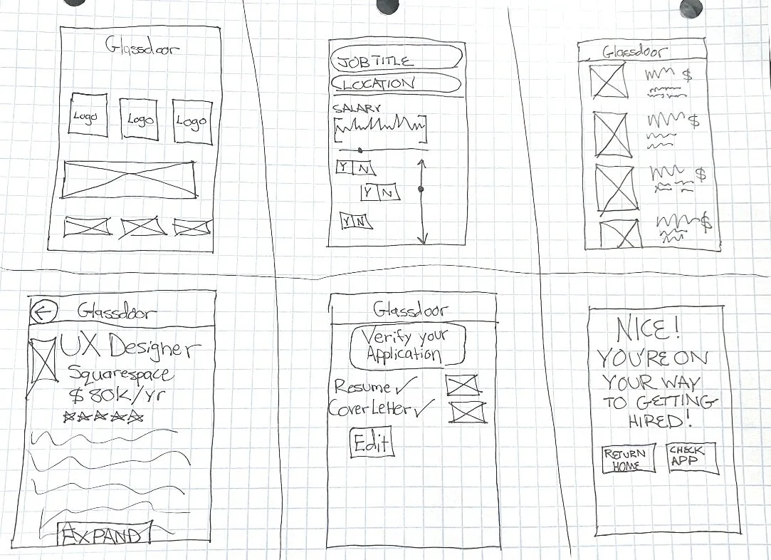
Let’s sketch it.
To validate our findings, we sketched several screens that focused on the features that we wanted to improve. We also conducted several design challenges to unify our creative solutions into one design.
Let’s build it.
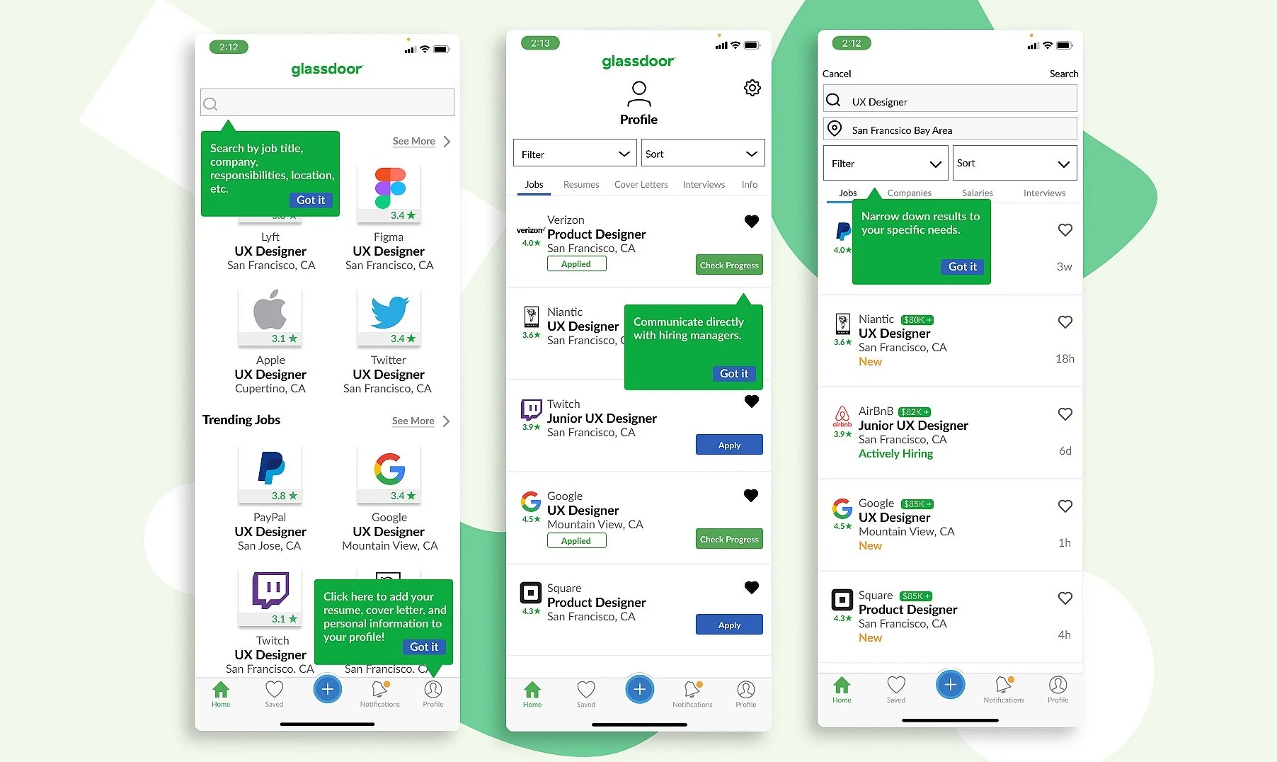
Once we applied our sketches to our mid-fidelity wireframes, we realized we needed to organize features to fit in with Glassdoor’s navigational organization. At this phase of our design process, I worked on the search and job screens. My intentions were to create a way to better digest information with a clean and simple format. To create a better way to track jobs, I added a “check progress” feature to encourage applicants to message potential employers.

Let’s test it!
Round 1 of User testing
The goal of this study is to test the user on the search, filter, and easy apply features of the Glassdoor app. We asked 3 participants over Zoom to test the Glassdoor app prototype on Figma
Participants:
Findings
We found that most users were most curious about the home screen and usually spent several seconds longer before continuing to search. There was confusion over the sorting and filter features. Users expressed a need for salaries in the short description for jobs. There was also concern about getting updates on their job progress.
Challenges
Our team had tight time constraints as 2 out of 3 members had limited availability. In order to meet our deadline for the second round of user testing. We needed to synthesize our first round of user testing and move forward with the deliverables for our mockup within a 48 hr period.
Solutions
My original intention was to make the filter and sort features easier for users. But after testing, the data proved otherwise. So my solution was to refine these features to be simpler and less redundant.
Prototype time!
In order to stay on brand, I made sure we included existing designs from the mobile app. I also consistently looked for ways to compliment Glassdoor’s current design while improving its efficiency. We thought of several ways to create engagement and build trust with our users. We did this by confirming actions before submitting them on the application screen.
Let’s test it, again!
Round 2 of User testing
We tested 4 users with the mockup over zoom. Our goal was to see if the change in the sort and filter options improved.
Participants:

Findings
Users spent up to 15mins on engaging with the mobile app. Some users felt that the homepage was interesting but found it less personalized to their needs. Additionally, some users were still confused over the filter and sort features. Users found the application and check progress features useful and easy.
Challenges
We found that the enlarged company logos on the home screen and job post screen heavily distracted users. We needed to find a better way to digest the logos visually. We also had trouble finding a better solution for the sort features.
Solutions
If we had more time on this project, we would work on personalizing the home page to be less distracting. Removing the filter and creating a simpler look for sorting jobs. Further user testing would be done to see if this resolves our issue.

Next steps
We planned to add a tool kit to guide new users through the mobile app. Our intention was to help users grasp Glassdoor’s full potential by adding useful tips. This version of the mobile mock-up was well received by users. However, there are still improvements that can be made. Given if we had more time we would’ve refined and expanded on other features of the app.